- Sketch
- Prototyping
- Wireframing
- UX Research
Poverty Solutions
As a Senior Web Designer at Michigan Creative, I had the opportunity to work on the Poverty Solutions website redesign. The initiative, entering its fifth year at the University of Michigan, needed a modern platform that could effectively communicate their mission and make their research more accessible.
The Challenge
Poverty Solutions had accumulated years of valuable research and resources aimed at preventing and alleviating poverty, but their existing website wasn’t effectively serving their needs. They needed a platform that could showcase their work and engage with diverse audiences, from academic researchers to community members.
The Process
Working as part of Michigan Creative’s team, I collaborated with content strategists, developers, and stakeholders throughout the project. Prior to my involvement in the design phase, the team had already conducted content inventories, initial content strategy planning, and created a new site map.
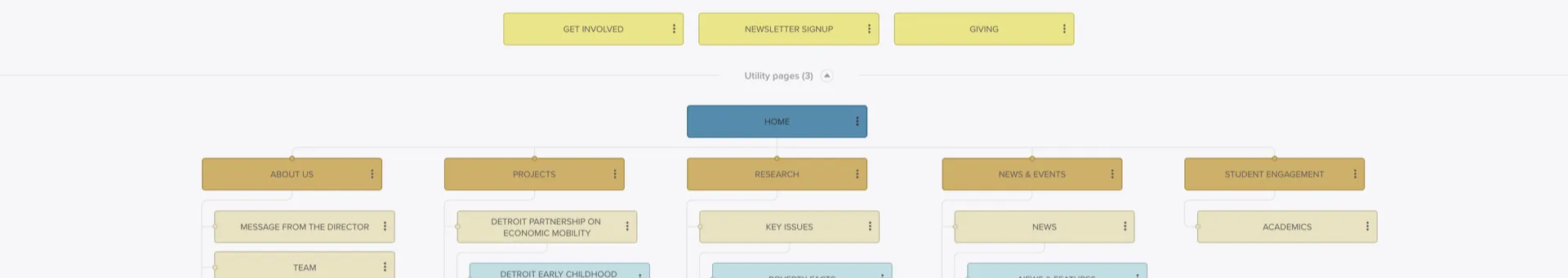
A version of Poverty Solutions’ new IA.
I begin every project with paper sketches—notes from discovery meetings, rough layout ideas, and initial concepts. These early sketches help me think through the information architecture and user flow before moving to digital tools.
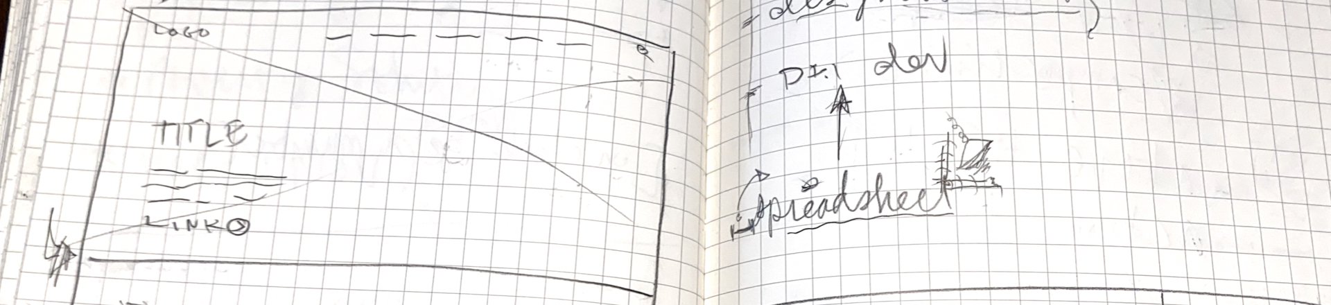
A tiniest and messy spark happening!
The wireframing phase utilized Invision’s Freehand tool, which proved invaluable for real-time collaboration with both our internal team and stakeholders. During this phase, I saw the beginnings of a design system and component library emerge, while also working out mobile optimization strategies.
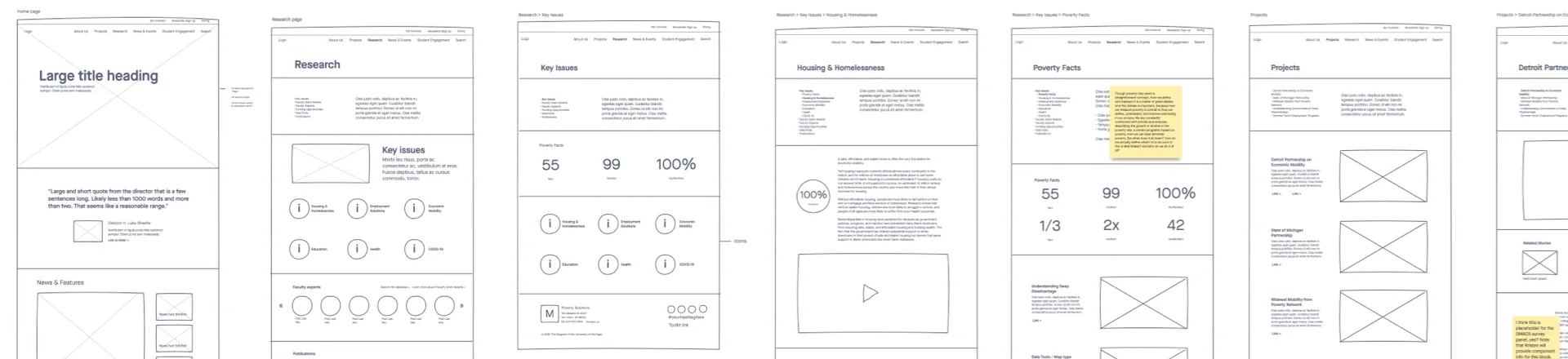
A note from one of the stakeholders visible.
Design Development
My approach to visual design started with typography. As a U-M property, we worked within their established color palette, focusing on creating accessible combinations and appropriate accent colors. I developed the layouts with careful attention to flow and hierarchy, informed by our earlier wireframes.
Having played music since middle school has influenced how I think about design layouts as having rhythm, with elements that speed up or slow down, creating a natural flow across the page. This rhythm needed to work across all screen sizes, so I continuously tested and refined the responsive behavior.
Refinement and Implementation
The final phase focused on extending the design system across all pages while incorporating feedback from both the client and our development team. We developed interactive elements, transitions, and animations that enhanced the user experience without compromising accessibility.
Throughout the process, accessibility remained a key priority, ensuring that the platform would serve all users effectively. Working within Michigan Creative’s established workflow, we maintained regular communication with stakeholders to ensure the design met their needs while adhering to university standards.
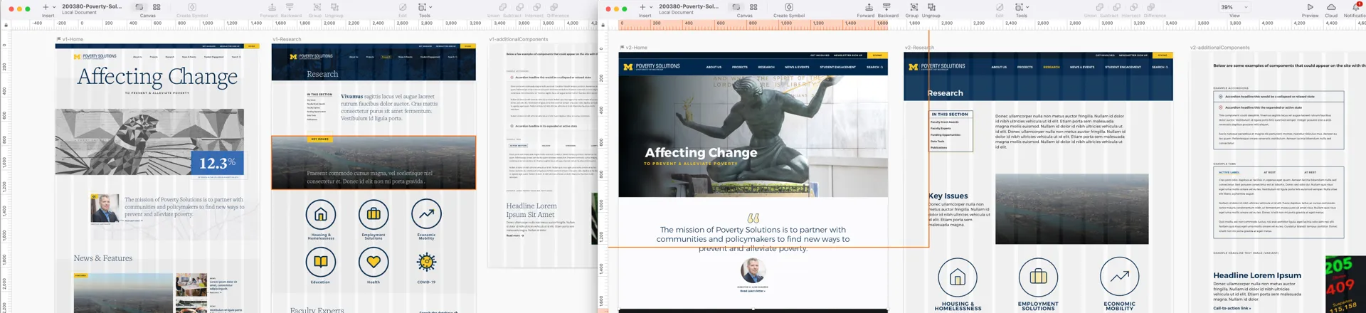
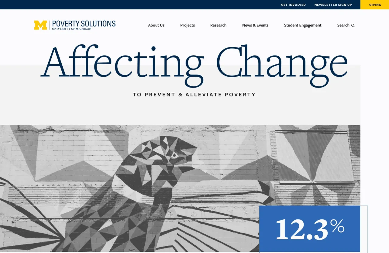
May I present two versions of the home page and an interior page.
Project Outcomes
The redesigned website successfully met Poverty Solutions’ goals of streamlining their communication tools and resources, effectively showcasing their research outcomes, and telling the story of their impact on poverty prevention and alleviation.